Caulk Art Colors: How to Choose and Apply Color in Caulk Texture Painting
Color in caulk art works differently than in flat painting. The raised texture changes how paint behaves, how light interacts with color, and which palettes look most dramatic. Here's everything you need to know about choosing and applying color in caulk texture painting.
Caulk Art Colors: How to Choose and Apply Color in Caulk Texture Painting
Color in caulk art is not the same as color in flat painting. The raised texture changes everything — how paint flows, how light interacts with the surface, which colors look vibrant and which look muddy, and how the painting reads from across the room versus up close.
Understanding how color works in caulk texture painting will help you make better decisions whether you're creating your own work or evaluating a finished painting.
How Texture Changes Color Perception
In a flat painting, color is straightforward: you mix a color, apply it to the surface, and it looks like that color. The surface is uniform, so the color is uniform.
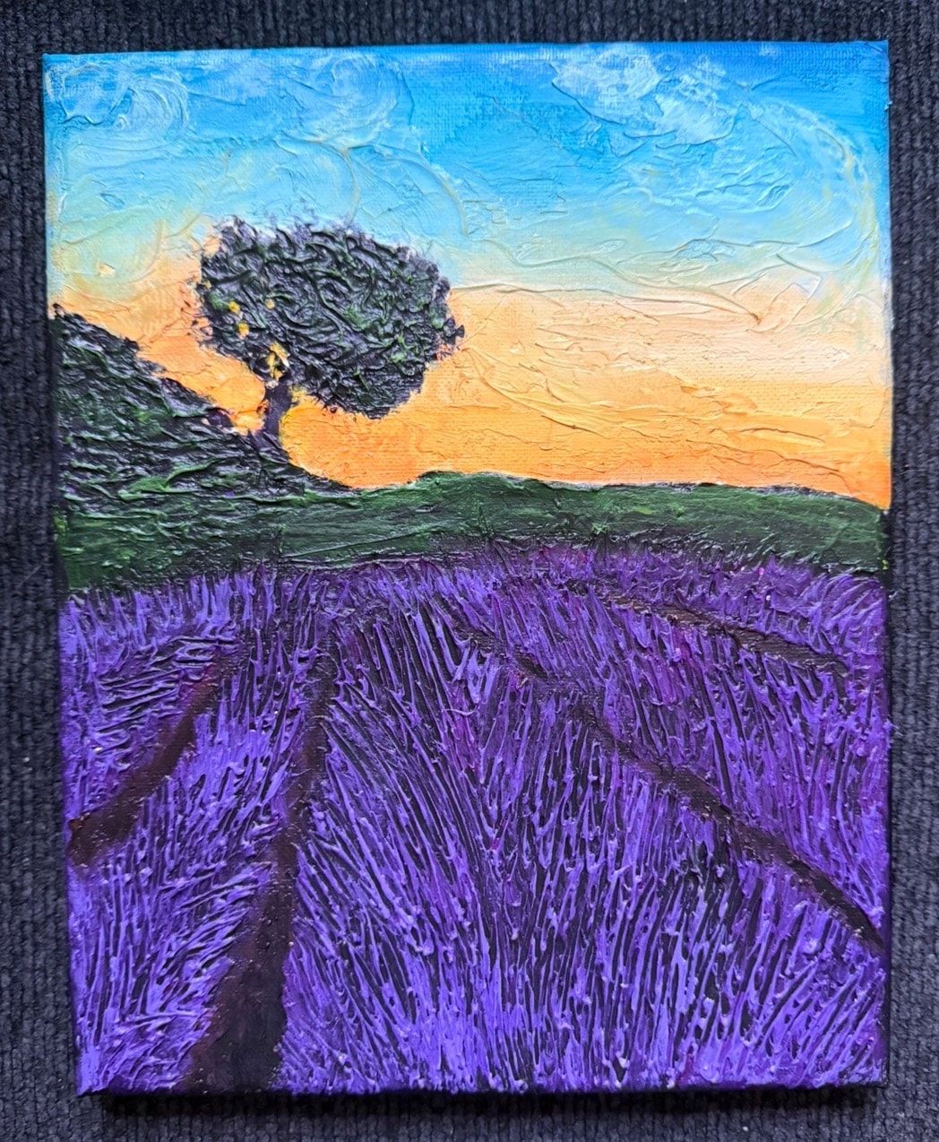
In a caulk texture painting, the surface is not uniform. It has peaks, valleys, ridges, and grooves. When you apply a single color to a textured surface, it doesn't look like one color — it looks like many.
Here's why:
The peaks catch light. The highest points of the texture receive the most direct light. Paint on these surfaces appears lighter and more saturated.
The valleys fall into shadow. The recessed areas receive less light. Paint in these areas appears darker and sometimes takes on a different hue entirely.
The angles create gradients. The sloping sides of raised forms transition between the bright peaks and the dark valleys, creating natural gradients that you didn't paint — the texture created them automatically.
This means that a single color applied to a caulk texture surface will appear as a range of values — from bright highlights to deep shadows — without any additional mixing or blending. The texture does the tonal work for you.
The Best Color Palettes for Caulk Art
High-Contrast Palettes
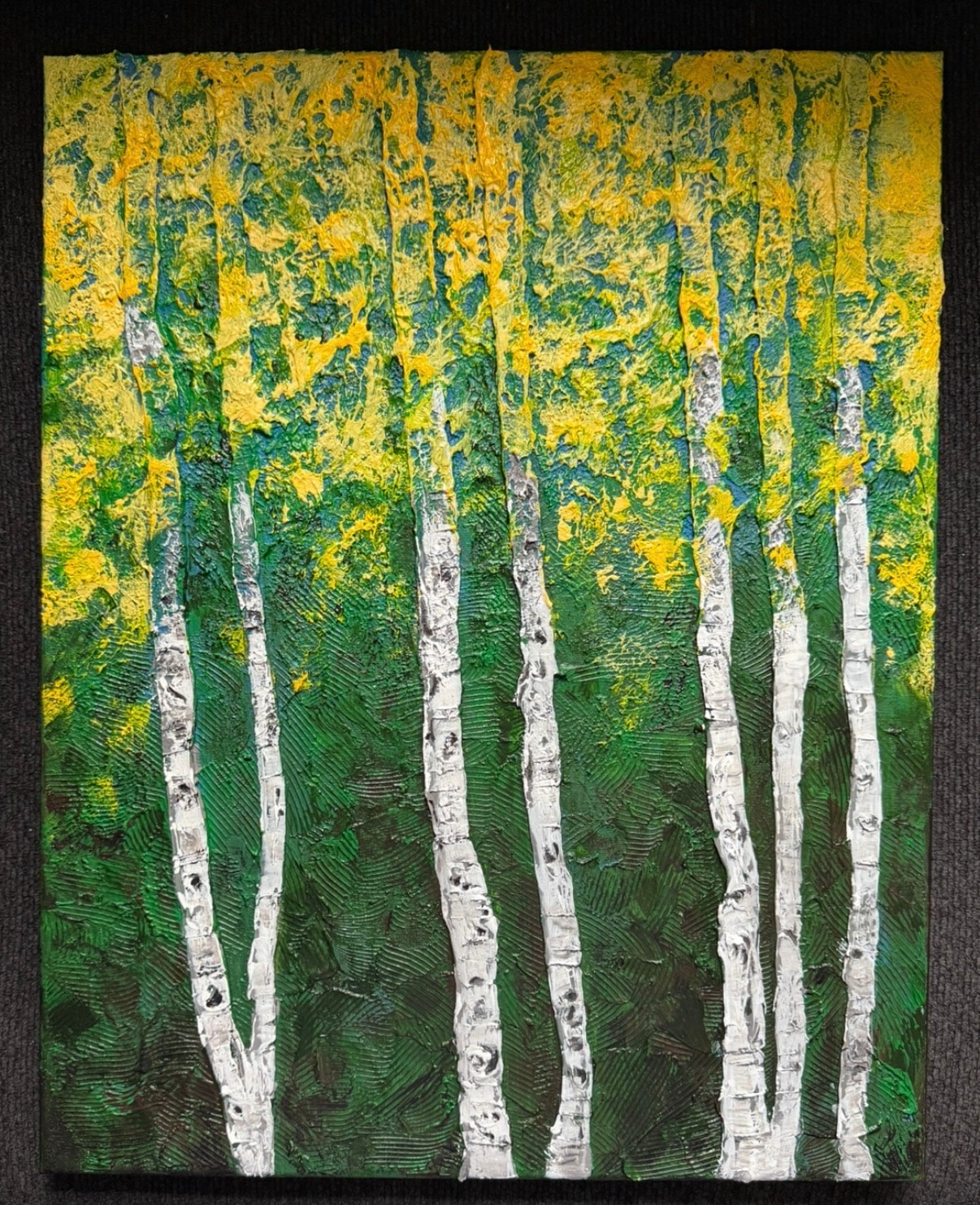
High-contrast color combinations — dark backgrounds with bright focal colors — work exceptionally well in caulk texture painting. The dark background recedes, the bright focal color advances, and the texture creates a range of values between them.
Examples:
- Deep navy or black background with bright yellow or gold focal elements
- Dark forest green background with vivid red or orange
- Near-black background with bright white or cream
Jay's forest paintings often use this approach — dark backgrounds that make the bright foliage and light-catching tree trunks pop dramatically.
Warm Earth Tones
Warm earth tones — ochres, umbers, siennas, burnt oranges — work beautifully with caulk texture because they suggest natural materials: stone, wood, earth, bark. The texture reinforces the natural quality of the colors.
Examples:
- Raw sienna + burnt umber + yellow ochre for a landscape
- Terracotta + cream + deep brown for an abstract
- Warm gray + rust + gold for a contemporary composition
Jewel Tones
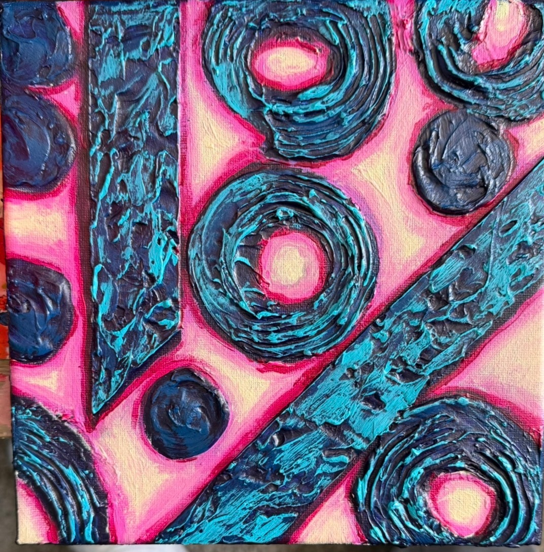
Deep, saturated jewel tones — emerald green, sapphire blue, ruby red, amethyst purple — look extraordinary in caulk texture paintings. The depth of the color is amplified by the depth of the texture.
Examples:
- Deep emerald with gold highlights
- Sapphire blue with silver or white peaks
- Amethyst purple with warm gold accents
Jay's hibiscus paintings use jewel tones to great effect — the deep, saturated flower colors against textured backgrounds create paintings that are visually arresting from across the room.
Analogous Color Schemes
Analogous colors — colors that sit next to each other on the color wheel — create harmony and flow. In caulk texture painting, analogous palettes work well for landscapes and organic subjects.
Examples:
- Blue-green to teal to turquoise for a water scene
- Yellow to orange to red for an autumn landscape
- Purple to violet to blue for an abstract
How to Apply Color to Caulk Texture
Start With the Darks
Always begin with your darkest colors. Apply them first, working them into the recessed areas and grooves of the texture. Use a brush that's small enough to get into the low areas.
Dark colors in the recesses create the shadow that makes the raised areas appear to pop forward. Without this shadow, the texture loses its three-dimensional quality.
Build Up the Midtones
Once the darks are in place, apply your midtone colors to the middle areas of the texture — the slopes and sides of the raised forms. These colors bridge the darks and lights and create the sense of volume.
Highlight the Peaks
The final step is highlighting the peaks — the highest points of the raised texture. Use your lightest, most saturated colors here. A dry brush technique works well: load a brush with a small amount of paint and drag it lightly across the raised peaks, depositing color only on the highest points.
This step is what makes caulk texture paintings look three-dimensional. The bright highlights on the peaks, contrasted against the dark shadows in the valleys, create the illusion of real depth.
The Wash Technique
One of the most effective color techniques for caulk texture painting is the wash. Mix your color with a significant amount of water or medium to create a thin, transparent wash. Apply this wash over the entire textured surface.
The wash will settle into the recessed areas (darkening them) and sit lightly on the raised areas (leaving them lighter). This creates an automatic tonal variation that follows the texture perfectly.
Multiple washes in different colors can create complex, layered color effects that would be very difficult to achieve with opaque paint.
Colors to Avoid in Caulk Art
Overly Opaque Colors Applied Too Thickly
Thick, opaque paint applied heavily over caulk texture can fill in the recesses and flatten the texture visually. The goal is to let the texture breathe — use paint thinly enough that the texture remains visible and active.
Colors That Are Too Similar in Value
If your entire palette consists of colors that are similar in lightness/darkness (value), the texture will not read well. You need contrast between your darks and lights for the three-dimensional quality to be visible.
Muddy Mixes
Caulk texture painting involves a lot of layering and blending. Be careful about mixing too many colors together — the result can become muddy and gray. Keep your palette limited and your mixes clean.
Color in Jay's Caulk Art
Jay the Painter's approach to color in caulk texture painting has developed over years of working with the medium. His paintings are characterized by:
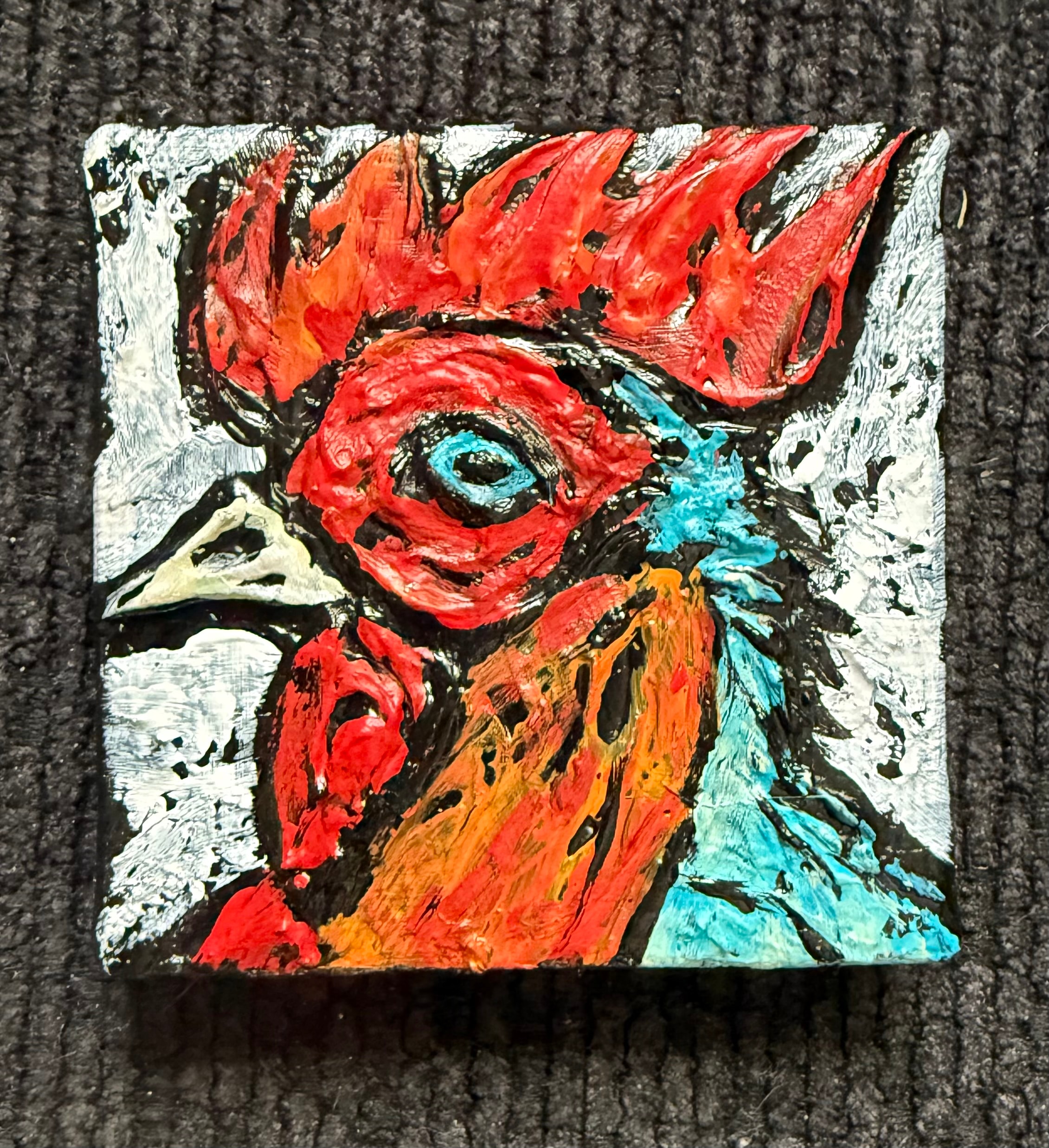
- Bold, saturated focal colors that pop against darker backgrounds
- Careful use of highlights on raised texture peaks
- Deep shadows in recessed areas that create real visual depth
- Color harmony — each painting uses a limited palette that works together
See the full range of Jay's color work in the gallery.
Interested in a commissioned caulk texture painting in specific colors? Jay accepts commissions and works with clients to develop color palettes that fit their space. Contact Jay here or call/text 330-285-3136.
Want to understand the full technique? Read the complete caulk art guide — covering what caulk art is, how it works, and what makes it different from every other texture technique.
Jay the Painter — original caulk art paintings from Akron, Ohio. Call or text 330-285-3136.